Pica, Pica, and Pica
by drjA short note on Pica and related matters
In typography, but particularly with reference to the typography of typewriters, Pica can mean up to 4 distinct things (maybe more?):
- pica: equal to 12 points [FOLSOM1990][MCLEAN1980]
- pica: size of traditional foundry type with a 12 point body
- pica: as a typewriter pitch, 10 characters per inch
- Pica: the name of a typewriter font
All sources agree that as a unit of measurement pica is 12 points. In the digital era a point is exactly 1/72 of an inch (thanks to PostScript), whereas in earlier eras not only was it not an exact fraction of a inch, it varied from region to region. So now a pica is exactly ⅙ inch, whereas it used to be about ⅙ inch.
Before foundry type was sold by point size, there was a system of named sizes: Long Primer (10pt), Pica (12pt), English (14pt), and so on. In my opinion this is confusing, and it also turned out that “pica body” from different suppliers would be different sizes.
Pica is also used as a horizontal measurement. Commonly for the measure of a block of text, which means its width. For example, the book i just looked up has a 23 pica measure.
Typical 20th Century typewriters seem to have settled on 6 lines per inch, meaning that the baseline-to-baseline spacing is... 1 pica! I suspect that this is why there is a typewriter font called Pica, and it seems to have become a sort of default (at least, there are multiple manufacturers offering a Pica font and they all look similar).
Here is Pica on the IBM Selectric (thanks to Nick Sherman), Brother daisy wheel (thanks to https://etzone.org/2018/03/09/absent-without-wheel/), and an Olivetti (probably the Olivetti Typestyles brochure on the archive).
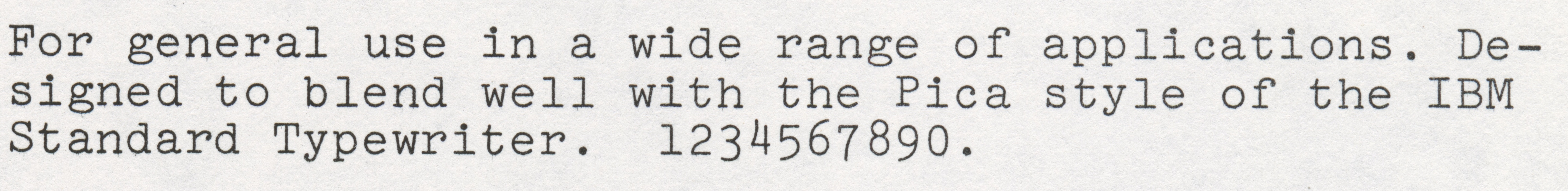
There is some variation between each manufacturer’s font, but they are all clearly interpretations of “Pica”. Pica is a monospace monostroke slab-serif with a large x-height. Generally based on a round/elliptic shape, with a near circular /o. Some ball terminals (on /a /c /g /r). Very large full stop (common on typewriter fonts).
On the Selectric (from IBM, which FontsInUse suggest is the origin for Pica the font), the /t has a distinctive ink-trap arrangement on the upper part, which has a curving fillet stroke and no vertical stroke above the crossbar.
The numbers of Pica are distinctive too, but i’ve left that for an appendix.
Monospace and pitch
The typewriter fonts called Pica were monospaced and around 10 characters per inch horizontally. The number of characters per inch is called the pitch, and pica is also used to refer to a horizontal pitch of 10 cpi.
On mechanical typewriters you can’t change the pitch, but you can manufacture them with a different pitch. The other pitch commonly manufactured was 12 cpi, aka Elite. Again, Elite is both a font for typewriters and a named pitch.
So, on typewriters, Pica and Elite are particular fonts, but because they became the names for the pitches, they also get used for generic fonts of the same pitch. So you could get Pica font (an actual Pica font), a pica font (generic or un-named font in pica pitch), and particular named fonts in pica pitch, such as Prestige Pica.
Another quirk of using Pica for typewriter fonts, is that even though the line spacing is 1 pica, the equivalent foundry type body size will not be 1 pica, 12 points, because of leading. Leading is in traditional metal typesetting the additional space between the lines (a strip of metal lead); a typewriter has an equivalent amount of space. On the Brother De Luxe i measured, the printed type is equivalent to about 10pt type with 12pt of line spacing; that is, 10 on 12.
Appendix on Pica Numbers
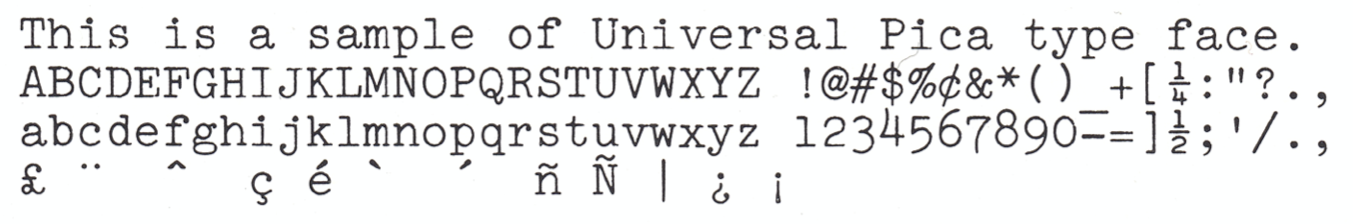
The numbers of Pica are a little bit unusual and seem to be distinctive to the Pica fonts. The general design follows principles of old-style numbers (with variation in heights), fine; but Pica numbers are not sized like old-style numbers, the Pica numbers are the size of Capitals, or bigger. /zero /one /two are the same size as capitals, and the other numbers, which ascend and descend, are bigger. The /four /six and /eight are drawn ascending: going from the baseline to above the Cap-line (though there is some variation here, the Brother Daisy Wheel has a lining /eight, and the /four is descending).
Appendix on Wood type and pica lines
The vertical use of pica, which is what Pica body size refers to, is also sometimes used as an implicit “line height”, in particular for wood type. A wood type (often much bigger than metal type) described as “4-line type” means 4-line pica, that is 48 points. Additional fun fact: apparently wood type, due to their generally large size, is measured from the baseline to the top-line (cap or ascender); as opposed to foundry metal type which would usually be measured on the whole body (from the descender of /p to the ascender of /d).
Appendix on Dot Matrix Printers
A lot of the design and terminology of Dot Matrix Printers came out of typewriter designs. On the Epson FX-80 the default settings are for a 12-point line spacing, exactly the same as a typical typewriter. The (digital, in ROM) font is 9 points high (from the bottom of /p to the top of /d) so is effectively equivalent to 9 on 12 as the typographers would say. The Epson FX-80 also supports two primary pitches, called Pica for 10 cpi, and Elite for 12 cpi in the manuals.
REFERENCES
[FOLSOM1990] “The Calligraphers’ Dictionary”; Rose Folsom; Thames and Hudson; 1990
[MCLEAN1980] “The Thames and Hudson Manual of Typography”; Ruari McLean; Thames and Hudson; 1980