Pica Numbers
by David JonesThere’s a fun fact about typewriter fonts that i mentioned in passing in my earlier pica article, that i’ll expand on here:
- On typewriters it is common to have a font where the numbers are bigger than the capitals.
(and by bigger i mean taller; all the glyphs are the same width, because this is a typewriter)
I’ve not seen other sources point this out directly, so it may even be my discovery—in the sense of me being the first one to write it down.
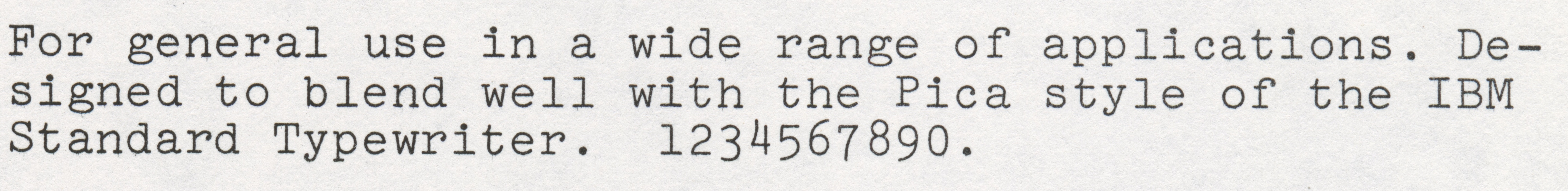
Here, the Selectric sample that i used in the earlier pica article.
Pica is the basic font that a lot of typewriters are fitted with, and here i’ll document a few Picas that have “numbers bigger than capitals”, then for contrast some that don’t.
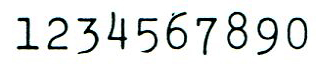
The fact that the numbers are bigger than the capitals isn’t super clear on the Selectric sample above. I’ve seen Nina Kalinina’s wonderful typewriter thread, so i knew she had an Olympus SM4—a classic described by some as the “Mercedes–Benz” of typewriters—and i knew the SM4 had similar numbers; i asked for a sample specifically to illustrate the number heights.
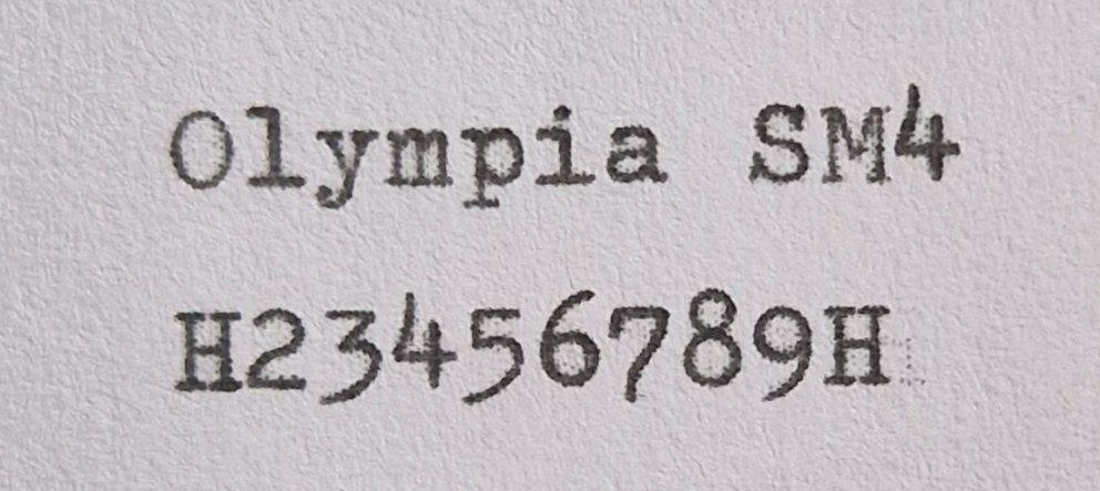
The 4, 6, 8 clearly ascend above the Cap-height (here represented by the H). Just like the Selectric.
The numbers are different heights. That itself is not so unusual, it’s called old-style or lowercase numbers in regular fonts. Here’s the font that Tufte uses in his books:
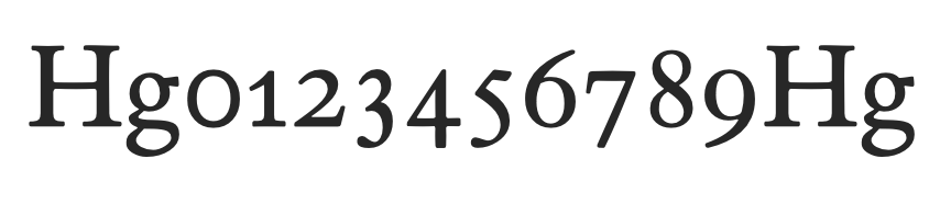
The unusual thing in typewriters is that the numbers are bigger than the capitals. The SM4 and Selectric follow a very similar ascending/descending pattern in their numbers, which is pretty typical: 3, 5, 7, 9 descend; 4, 6, 8 ascend. Which follows the usual style of lowercase numbers, which is perhaps why the typewriter numbers don’t seem that out of place, even though they are taller. (aside: as you can see in the ETBembo sample, the 4 descends—the 4 is a cheeky little number that doesn’t always follow any particular rules)
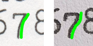
The Picas all vary a little from manufacturer to manufacturer and within a manufacturer from model to model or year, but the numbers vary more than the rest of the font. As an exercise, compare the SM4 sample, above, with the Selectric sample i showed first. There are differences in overall design: the Selectric /three is round-topped, clearly differrent from from the SM4 /three which is flat-topped. There are more minor, but still distinct, differences: the /five of the SM4 has a tail that terminates well to the left of its vertical stroke, on the Selectric the tail terminates directly underneath the vertical stroke; the /seven on the SM4 has an ogee, on the Selectric it has a simple arc.
Another example of a minor but clear difference, this time within a single brand, but in different time periods: the IBM Selectric III from 1980, has a nearly identical set of numbers to the earlier Selectric, but has a flat-topped 3:
Does this represent changing fashion in the highly fickled three-following market segment? Whimsy? Factory choice, parts supplier? Custom options? Maybe it’s hard to say, but it’s clear that we can’t say “the IBM Pica” (or the Olympia Pica or whatever) to mean a particular font; and given that many typewriters could be manufactured with different fonts, and quite possibly custom orders, it’s not sufficient to say the IBM Selectric Pica either. A careful study would have to be quite precise in identifying the exact font used on a particular typewriter.
Pica is an idea
I don’t think the previously illustrated differences are large enough to qualify as a truly separate font, they are more like minor variations on some abstract ur-Pica (which may or may not exist). Rather like when we say a Baskerville, or a Caslon when there are many different interpretations of what is essentially the same font.
20th Century classics
Let’s look at some samples from some other classic typewriters of the 20th century.
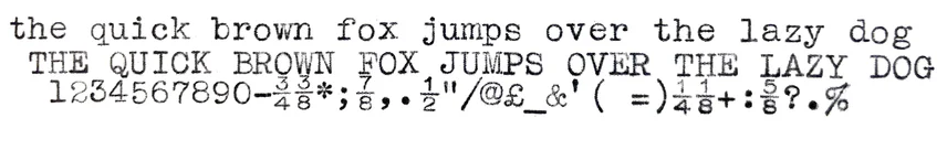
The Olivetti Lettera 22 was the typewriter that teenaged Joan Didion used (probably) and took to Berkeley. It has many other famous users and is well regarded as a classic. It also has an ascending 6 and 8, but not 4.
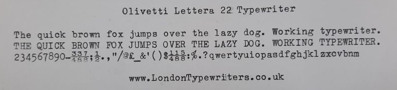
The /four is less consistent, in terms of whether it ascends or not, and this follows the situation in most lowercase number styles in regular fonts.
The Olivetti Valentine was not that well regarded as a typewriter, and not hugely successful commercially either, but later gained recognition for its visionary design in bright red; it is now regarded as a classic after the fact and quite collectable. Launched on Valentine’s Day in 1968, it marks a move towards cheaper durable consumer items fabricated in a revolutionary new material: plastic.
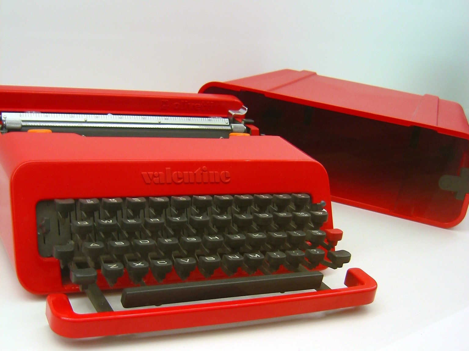
The sample shows it to be identical (or nearly so?) to the Lettera 22 from the same manufacturer, so typographically it‘s not that interesting an addition, i just wanted an excuse to show the typewriter itself.
The Hermes 3000, treasured by Sylvia Plath who wrote The Bell Jar on hers. It too has a Pica:
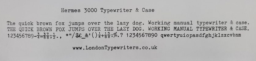
On the Hermes 3000, only the 6 ascends. The 3, 4, 5, 9 descend, so they are also bigger than the capitals. Beeching [BEECHING1974] has what i assume is a reproduction of Hermes advertising materials from the time, which strongly imply that they make a range of fonts that can be fitted to any of their models (within various design constraints), and that therefore their Pica is consistent across their range of typewriters. They also have a very clear sample that shows that the 6 ascends and the 4 does not.
Digging around we find Picas with ascending numbers, sometimes just the 6, but sometimes the 8 as well. Most have some numbers with descenders. I’ve seen “numbers bigger than capitals” in Picas from Adler, Brother, Imperial, Silver Reed, Smith Corona; even if not universal, a clear pattern emerges: Pica fonts on typewriters often have numbers bigger than capitals.
Lining
Common, but not ubiquitous. Here is a sample from the Imperial The Good Companion Nº 1 (a tie-in with the J. B. Priestley book of the same name):
We can tell it’s a Pica font from the /Q /a /j /t /ampersand (and others). But the numbers; the numbers are lining, that is they are generally the same height as the capitals and neither ascend nor descend. This sample by the way, wins the prize for best asterisk in this article, a real star.
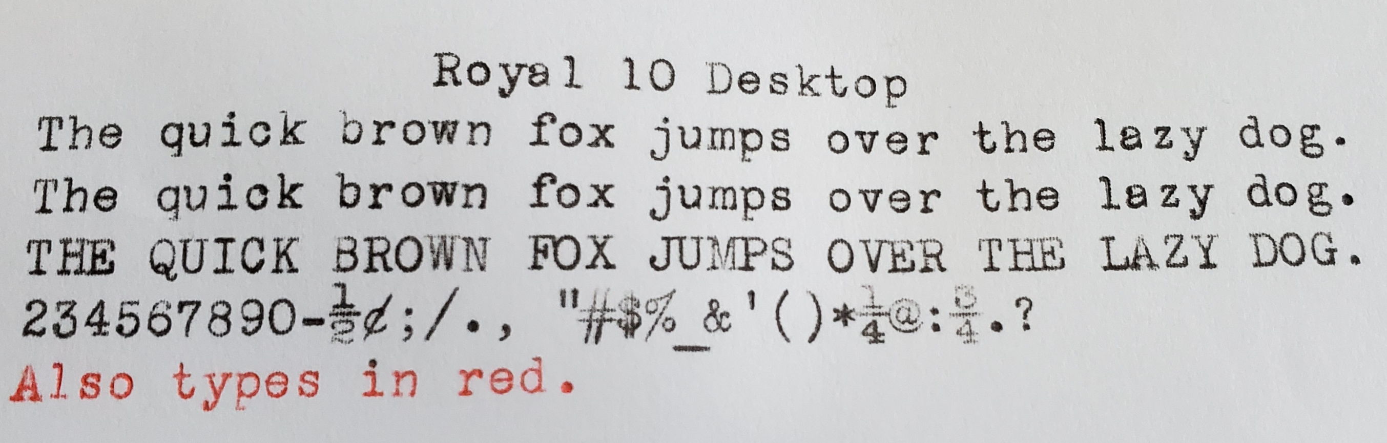
Another set of lining numbers can be seen on the Royal 10, the typewriter that Taylor Swift features in her music video Fortnight:
So what?
It’s actually unusual for any font to have numbers bigger than capitals, and then we find a niche where not only do we find one instance with numbers bigger than capitals, but we find a whole tranche: The typewriter Picas (generally).
Typewriter fonts seem to be a bit neglected, or at least passed over in discussions of fonts, font design, and font designing. My library isn’t extensive, but i have collected some of the go-to essentials for type and design advice. What do they have to say?
Karen Cheng [CHENG2020] spends a 2-page spread discussing oldstyle and modern figures, mentions hybrids, but doesn’t mention that typewriters have numbers bigger than capitals. No mention of typewriter in the index to Robert Bringhurts’s Elements [BRINGHURST1997] (and i flicked through a few of places where numbers are discussed). No mention that some designs may have numbers bigger than capitals in The Orange Book [HENESTROSA2017].
So this thing about numbers being bigger than capitals just isn’t a thing people write about. I skimmed “Century of the Typewriter” [BEECHING1974], but no mention of it there either.
What is a Pica?
An issue i’ve been skirting around the edges of. Are all these examples even Pica fonts? Is Pica even a font?
As i said earlier, i tend to think the answer to both is yes, but i accept that the issue isn’t clear cut. The origins of both the design and the name seem clouded. And while by the time of the Selectric, IBM are using Pica to mean a particular font design, i don’t think they are unique in that respect, and there are examples of that design that predate the Selectric (and indeed older IBMs like the Model A).
Perhaps the topic of another article?
Appendix on /zero and /one
Some of the samples lack a 1 (/one) or a 0 (/zero). That’s because some typewriters lacked those keys. To save space, weight, and manufacturing costs (so more common on portables and consumer models), a 1 could be typed using the lowercase L, and a 0 could be typed using the uppercase O. Obviously typographically unwise, but a pragmatic compromise.
Acknowledgements
Thanks to Nick Sherman for the Selectric sample (from flickr), Nina Kalinina for the Olympia SM4 sample, London Typewriters for the Lettera 22 and Hermes 3000 samples, Charlie Foxtrot Vintage for the Valentine and Imperial samples, Typewriters 101 for the Royal 10 sample, dr. shordzi (on flickr) for the Selectric III sample. The Olivetti Valentine is by Ricky Webster, CC BY-NC-SA 2.0.
The Typewriter Database was very useful for general research, but their samples of typing are generally small so i didn’t end up using them.
REFERENCES
[BEECHING1974] “Century of the Typewriter”; Wilfred A. Beeching; Heinemann; 1974
[BRINGHURST1997] “The Elements of Typographical Style”; Robert Bringhurst; Hartley & Marks; 1997
[CHENG2020] “Designing Type”; Karen Cheng; Laurence King Publishing; 2020
[HENESTROSA2017] “How to create typefaces”; Cristóbal Henestrosa, Laura Meseguer, José Scaglione; Tipo e Editorial; 2017