mica—a utility for missing accents
by David Jonesmica is short for MIssing Composable Acents.
It's a command line utility that i wrote to answer the question
"have i missed out any glyphs from this font that i could easily add".
The basic idea of mica, as explained in the
README, is:
if the font has a and ü then it should also have ä.
a + ü ⇒ ä
It works by processing every Unicode codepoint that has a decomposition, then working out if the decomposition uses only components that are already in the font.
So in the opening example, ä decomposes to 0061 0308 and the
font already has U+0061 (a) and U+308 (the diaeresis),
then the font should also add ä.
So how does it perform in practice?
A font like Fira Sans is professionally made, and has reasonably good coverage for the Latin, Greek, and Cyrillic scripts. It’s also licensed with SIL, an open license that means you can use the font too.
Here's the start of the output:
; mica /Users/drj/f/panel-o/FiraSans-Medium.otf
Consider U+0340 → [0300]    COMBINING GRAVE TONE MARK
Consider U+0341 → [0301]    COMBINING ACUTE TONE MARK
Consider U+0343 → [0313]    COMBINING GREEK KORONIS
Consider U+0344 → [0308 0301]   COMBINING GREEK DIALYTIKA TONOS
Greek
Already we see something that isn't clearly actionable. Yes, i accept that COMBINING GRAVE TONE MARK is the same as COMBINING GRAVE ACCENT, but:
- it’s only used in polytonic (ancient) Greek; and,
- it may well be drawn differently anyway.
Adding polytonic Greek to your Greek font may not be as simple as adding a bunch of accents to existing glyphs. For one thing DIALYTIKA TONOS is two accents, one stacked above the other, which may dramatically change the vertical spacing of the font.
That's why mica says "Consider";
it's up to you what you do with the output.
Ring Below
Pressing on, we see some notes that are more like the intended use of
mica:
Consider U+1E00 → [0041 0325]   LATIN CAPITAL LETTER A WITH RING BELOW
Consider U+1E01 → [0061 0325]   LATIN SMALL LETTER A WITH RING BELOW
Consider U+1E06 → [0042 0331]   LATIN CAPITAL LETTER B WITH LINE BELOW
Consider U+1E07 → [0062 0331]   LATIN SMALL LETTER B WITH LINE BELOW
So obviously Fira Sans has A and, less obviously, it also has
U+0325 COMBINING RING BELOW.
So, mica reasons, consider U+1E00 because it would be easy to add.
Weirdly it turns out A WITH RING BELOW is the only letter (in capital
and little case) in Unicode to use the U+0325 COMBINING RING BELOW
accent, and while Fira provides the combining mark, it doesn't
provide the only letter which uses it.
[later: i discover that Fira
Sans can render A WITH RING BELOW, because harfbuzz will use the
components and the mark feature; this comes up again when i mention
Liberation Mono below]
B WITH LINE BELOW is a more typical case. Fira Sans provides U+0331 COMBINING MACRON BELOW and it provides other letters that use it, like T WITH LINE BELOW, they just "forgot" to provide B WITH LINE BELOW.
Following on from that
Accents above and below
Consider U+1E08 → [00C7 0301] LATIN CAPITAL LETTER C WITH CEDILLA AND ACUTE
I only discovered letters like this since becoming a type designer. There are some letters that have an accent on the bottom and on the top. Most of these seem like particular easy targets, it's entirely possible that the font already has C WITH CEDILLA and C WITH ACUTE so no new anchors are required: the font already "knows" where the CEDILLA and ACUTE should go.
There are quite a few of both missingle single accents and missing accents below and above. And then...
Double accents
Consider U+1E4E → [00D5 0308] LATIN CAPITAL LETTER O WITH TILDE AND DIAERESIS
Unlike the previous double accent CEDILLA and ACUTE which attach to different parts of the base letter, TILDE and DIAERESIS are both "top" marks and go above the glyph.
This does present new vertical spacing considersation for a font, and you may not have the budget for that. But actually in this case Fira Sans already supports the double accents needed by Vietnamese, so could probably reasonably easily add O WITH TILDE AND DIAERESIS. There are a bunch of these.
Languages and so on
The bulk of the report is more of the above. Letter–accent combinations that are "missing" from the font. The rest of this example output is non-linguistic so this provides an opportunity to pause and reflect before the final stretch.
My guiding opinion is that it would be foolish to have a font not
support a language if it is easy to add.
Where "easy to add" in terms that mica understands means
"possible to add glyphs merely by combining existing components".
This opinion exists, of course, in the wider constraints of budgets (money, time, space). You may not have the budget to add Cyrillic, but maybe you can add ŵ as you already have the necessary parts.
Fonts as both a linguistic object and a graphic object. I can't ignore the fact that fonts are used socially to communicate with one another in agreed-upon writing systems. But they are also graphic objects and might be used simply for their graphic designs. From that perspective you might want to add all the symbols that you can. Who cares if your Livonian support is incomplete, you added the letters that you had existing combinations for.
That brings me to
the mark feature
Clearly we ought to be combining base letters and accents in some
sort of systematic and possibly programmatic way.
OpenType Layout Features has a mark table which allows precisely
that.
For pairs of base glyphs (like A) and mark glyphs (like ACUTE)
you can say, with a GPOS lookup, where the mark is positioned on the
glyph.
And you can do this either for individual pairs or whole classes at
once.
OpenType ligatures and other replacement features can take out
special cases at an earlier stage in the glyph shaping pipeline.
My impression is that so far this has been used for non-Latin letters, but there's no reason that it can't be used for Latin letters.
It should.
In modern font engines (harfbuzz) this Just Works, but
it's still relatively rare to see a font targetting Latin that uses
it.
There is a larger rant/article to be written here but one of my points is: a font should try and enable typographic possibilities not restrict them.
The final stretch
The final block of the output from mica is:
Consider U+202F → noBreak[0020] NARROW NO-BREAK SPACE
Consider U+212A → [004B]    KELVIN SIGN
Consider U+212B → [00C5]    ANGSTROM SIGN
Consider U+219A → [2190 0338]   LEFTWARDS ARROW WITH STROKE
Consider U+219B → [2192 0338]   RIGHTWARDS ARROW WITH STROKE
Consider U+21AE → [2194 0338]   LEFT RIGHT ARROW WITH STROKE
Consider U+2249 → [2248 0338]   NOT ALMOST EQUAL TO
Consider U+226E → [003C 0338]   NOT LESS-THAN
Consider U+226F → [003E 0338]   NOT GREATER-THAN
Consider U+2270 → [2264 0338]   NEITHER LESS-THAN NOR EQUAL TO
Consider U+2271 → [2265 0338]   NEITHER GREATER-THAN NOR EQUAL TO
The first of these U+202F NARROW NO-BREAK SPACE is the first one we
have seen to use a <noBreak> tag.
Unicode characters can have tags on their decomposition.
No tag, or the empty tag,
is a canonical decomposition and is applied when
using Unicode Normalization Form D.
Other tags are used for, well, other things.
The noBreak tag was the only one i thought i could enable by
default, and i intended for it to catch missing U+00A0 NO-BREAK SPACE
(which it does, but Fira Sans supplies it).
But it also much more commonly catches U+202F NARROW NO-BREAK SPACE. Now, i think that this character is not really "the same as" U+0020 SPACE (the regular space); the "NARROW" in the name implies it should have a different width. But i can see that in compiling indexes for searching text, you probably do want to consider the two spaces to be the same.
And that aside, it would seem to be relatively simple to "design" the space character. You have to decide how wide it is, and whether you want to kern it (with T for example).
KELVIN and ANGSTROM really are the same as K and Å, it's just that for historical reasons the glyph is duplicated at a different codepoint as well. May as well add them.
The remainder are all something + U+0338, which is COMBINING LONG SOLIDUS OVERLAY. Which typically looks like a diagonal stroke.
It's basically the slash in the ≠ sign.
In fact, Fira Sans doesn't supply U+0338, but it does supply U+2260
NOT EQUAL TO, and NOT EQUAL TO decomposes to 003D (=) 0338.
mica reasons that if a codepoint can be decomposed into components
then those components can be re-used in other codepoints.
Should fonts supply NOT LESS-THAN? Why not. Even if it's not exactly the composition of LESS-THEN with U+0338 it's close enough to be easy to design.
Is the slash of ≮ the same as the slash of ≠ ? Well there are two answers to that:
- probably not; but,
- it was hard to find samples as the glyph is not well supported.
I have been making a small selection of "open computery type" fonts and NOT LESS-THAN does not appear in: Fira Sans, IBM Plex (Mono or Sans), Roboto Mono, Ubuntu (Regular and Mono), Zilla Slab, nor Overpass.
It does render in Liberation Mono, but the rendering is incorrect:
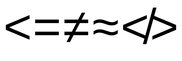
This is because Liberation Mono doesn't have the glyph directly, but
does have the components (in particular U+0338) and harfbuzz has
rendered it as U+003C U+0338 and there
is no mark feature to correctly position the slash mark.
Poking around the system fonts supplied with my Mac, the only ones i could find that render NOT LESS-THAN were Apple Symbols and Menlo (i wasn't very systematic); and the rendering in Apple Symbols is off. (also, it seems to glitch-out Apple's system for selecting alternate fonts to render as it was locking the cursor for several seconds in TextEdit).
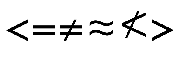
Menlo led me back to Deja Vu (the description field of Menlo, displayed in Font Book, tells me it's based on Deja Vu). Deja Vu does include NOT LESS-THAN:
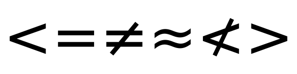
If nothing else i suppose that it shows that mica is also good for
spotting bugs in fonts and their rendering technology.