Kerning, the Hard Way
by David JonesHere is a font i am working on; i hope you like it.
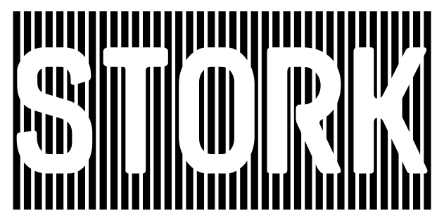
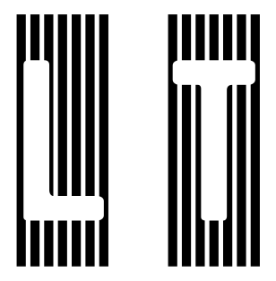
The letterforms are reversed out against a vertically striped background. In a manner similar to Schaeffer Versalien. The graphic effect is inspired-by/stolen-from Schaefer Versalien, but the letterforms are modified from my found stencil font Arugula. The colour version of this font (which this was preparing for) is now published as Rainbow Rocket in more than 20 colourways.
Bear in the mind that with a font like this, the parts that are drawn are the black parts.
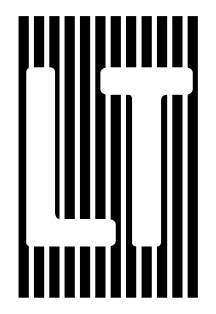
So, let's consider a word like SALTY:
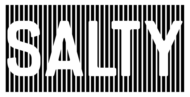
Looks okay? Perhaps you think is fine and there is nothing to comment on.
What about the kerning, in this case between L and T?
In the good old days of metal type the only kerns were when /f projected
outside the edge of its body.
This would not have been kerned and we were ok with that
(larger wooden type may have been kerned with a saw or a file, but
in this design, the cuts would have to be made to line up the stripes
exactly; tricky business).
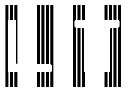
Here’s what this particular example looks like without kerning:
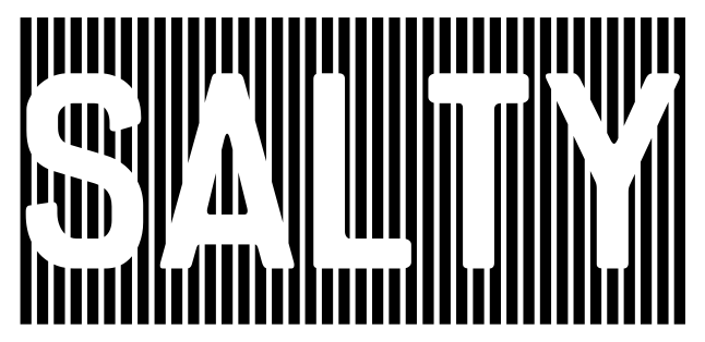
I’m not going to go back and forth over the merits of kerning, i‘m here for the nerdy technical details.
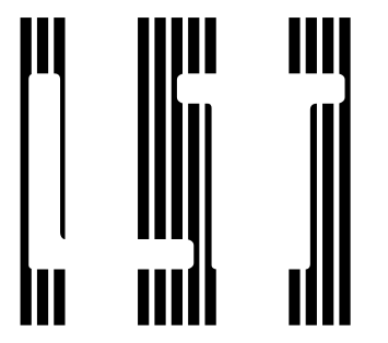
In most, normal, fonts kerning is done with position rules (GPOS lookups); that doesn’t work here, because if we reposition T to be slightly further left, we get something like this disaster:
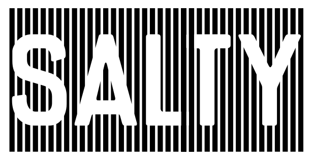
It looks a bit like L and T have been clipped, but in fact they’ve been drawn over. Black parts of L overlap the T, and vice versa: black parts of the T overlap L. The effect is what you can see, where L and T share a space, the black bars overlap and are solid, obliterating the reversed out letterforms.
So how do i kern this font, if not with GPOS lookups?
With GSUB lookups! GSUB (for substitution) lookups substitute one sequence of glyphs for another. The details can get quite complicated, but the way i use them here is relatively simple.
I split L and T into two pieces each, and recombine the middle two pieces into the drawing of the kerned part.
I’ll illustrate the steps. With glyphs that have been articifically spaced out, so that you can see each individual glyph.
L and T as individual glyphs
Each of L and T is split into two pieces. So we get 4 glyphs:
/L.left /L.right /T.left T.right.
This is done with GSUB lookup rule like sub L by L.left L.right ;.
The two middle pieces, /L.right and T.left, get replaced with
what i call a joiner the kerned piece in the middle shared by
both L and T.
Here the GSUB rules look like sub L.right T.left by L_T.joiner ;.
That’s actually it. The next image is just the previous one without the extra spacing, and is how it would actually appear.
Notes
The pattern of vertical stripes means that kerns can only be a multiple of the stripe repeat (not quite true, and i have sketched out more general versions of this, but it is true for this font).
The gaps in the pattern help avoid solid black-to-black joins, which
might work when everything is a vector, but tend to leave sub-1-pixel
gaps when rasterised.
The gaps are also why a glyph isn’t split down the middle to
make the .left and .right parts.
That would leave a sub-1-pixel gap when rejoining.
Better to split at a gap.
The glyph names, used in the rules above, don’t matter at that level, but i suspect affect the PDF; in particular cutting-and-pasting from PDF, so there might be some tweaking of names.
For each letter (glyph) that participates in kerning, there
are two more glyphs for its .left and .right parts.
And...
For each kerned pair there is a glyph for its joiner, because each one is unique. Those are going to mount up quickly, which suggests kerning only when strictly necessary.
None of the splits and joiners are drawn by hand, and none of the GSUB rules are made by hand. In both cases it is a Small Matter of Programming, also known as Custom Python Scripts. The libraries fontTools and fontFeatures were invaluable in this.
This font is not yet complete, but right now it is a real font and really does work like this. I've only kerned L, so there’s a few more kerns to do. And right now is has a very basic alphabet, just A to Z; i will draw some more letters and a few more decorative items, but i plan for it to have a fairly small repertoire, partly because the kerning and the vertical stripe design add to the constraints.
And if you thought kerning was problematic (and hopefully now you do), consider how accents and other diacritics are going to work. ;)