A Preview of 6 Books
by David JonesNot so much reviews, more like a taste of a few books in my typographic collection. I'm expanding my collection, and most of these I have only dipped into, but I am working my way through some of them and expect to be revisiting them all.
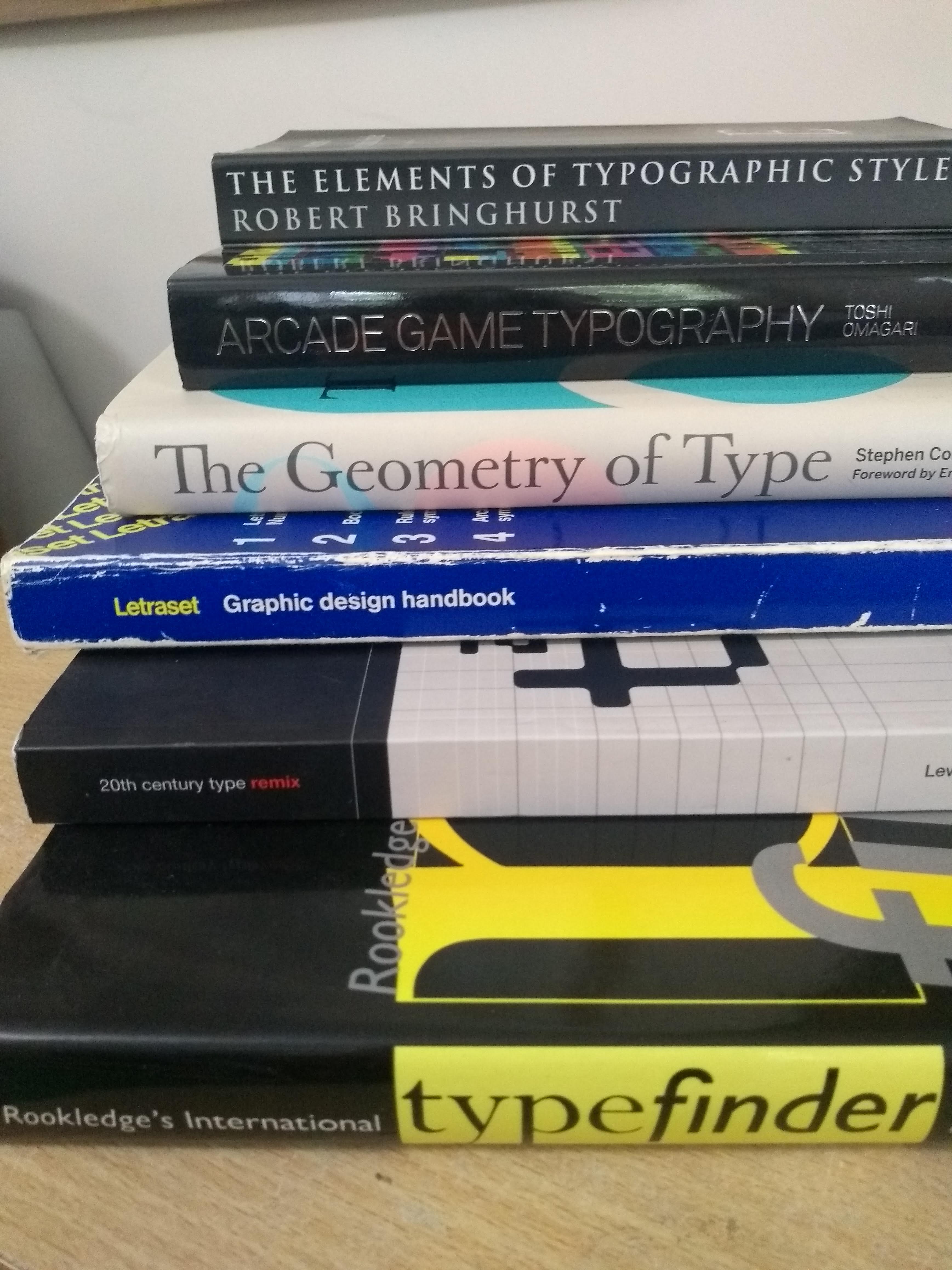
Bringhurst, “The Elements of Typographic Style”
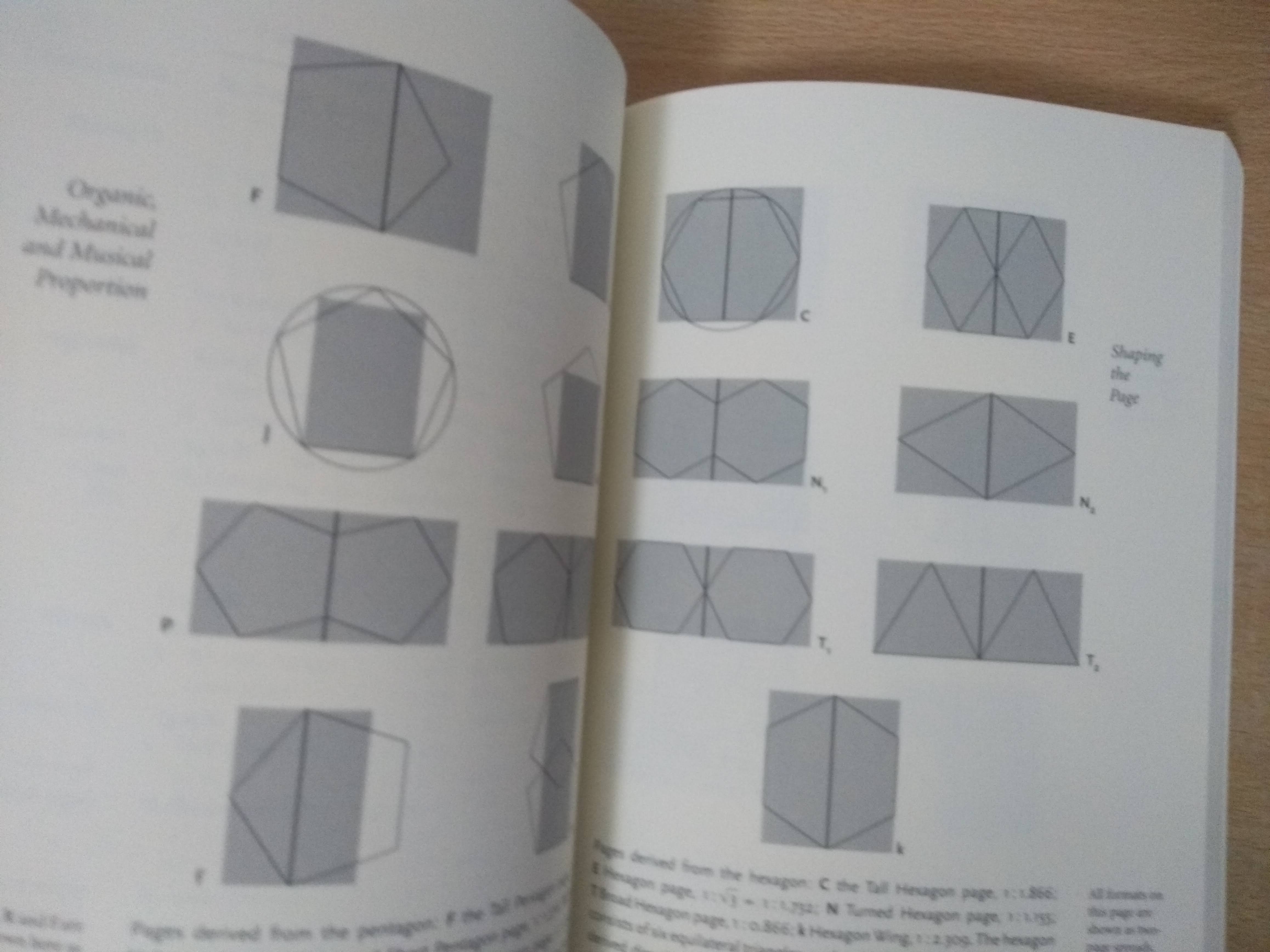
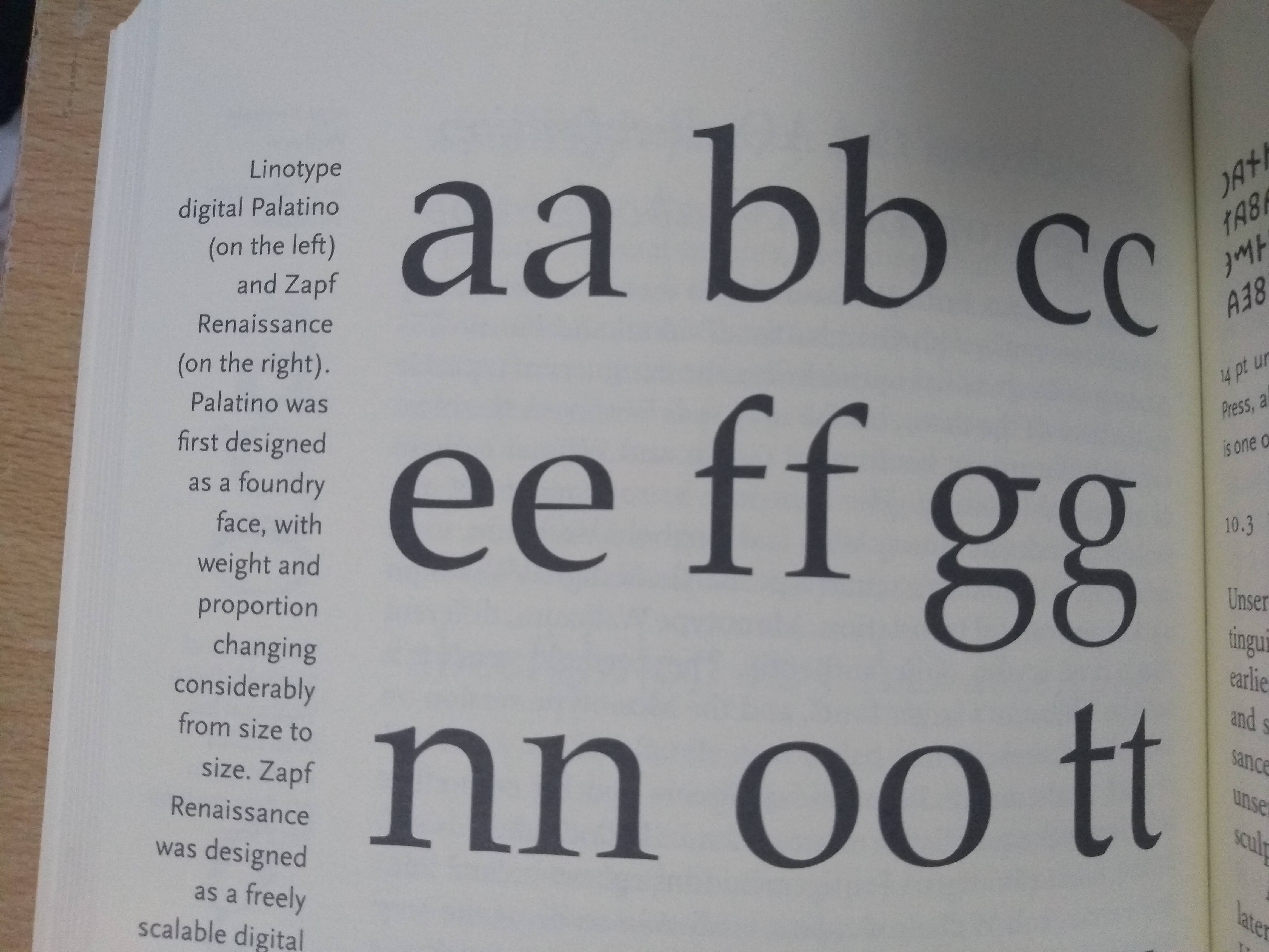
Highly recommended (by everyone, not just me).
The book that has it all (almost). Comprehensive, authoritative, well researched. The whole typographic stack is here from the foot of the most obscure glyph to the designs of the largest poster. An excellent manual. Bringhurst’s voice reads like a trusted companion on your typographical journey. There is respect for traditions and history, but also a positive flair for a new order, without knowing exactly where the future will take us.
Coles, “The Anatomy of Type”
aka “The Geometry of Type”.
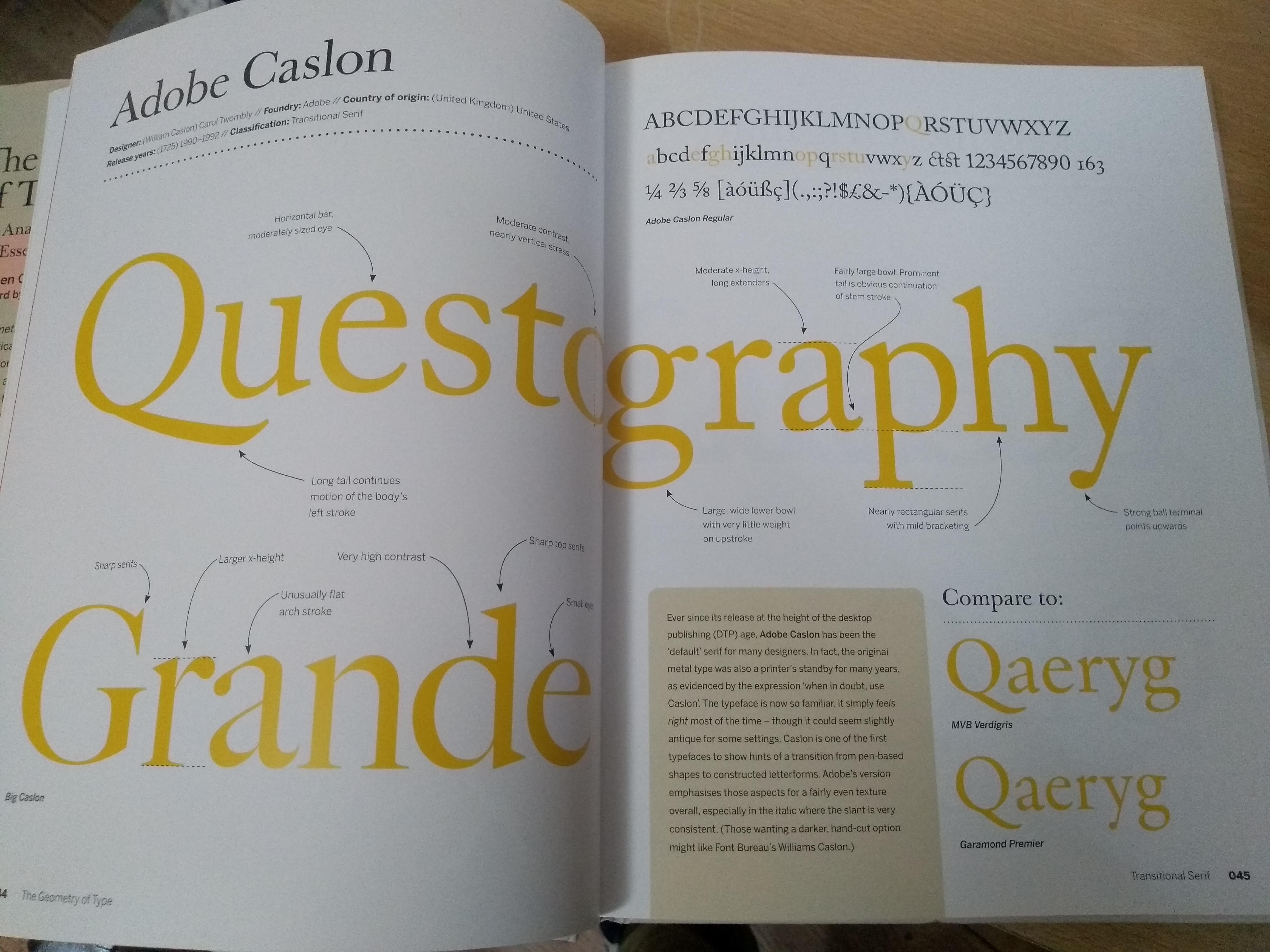
More thoughtful and insightful than a mere specimen catalogue. Across the range of type classifications, 100 typefaces are chosen; one font displayed on each double spread. The curation is excellent, and while I find the commentary a little dry at times, the book is beautifully made and lovely to look at. Intelligent and useful selections of glyphs and alternatives.
“Rookledge's international typefinder”
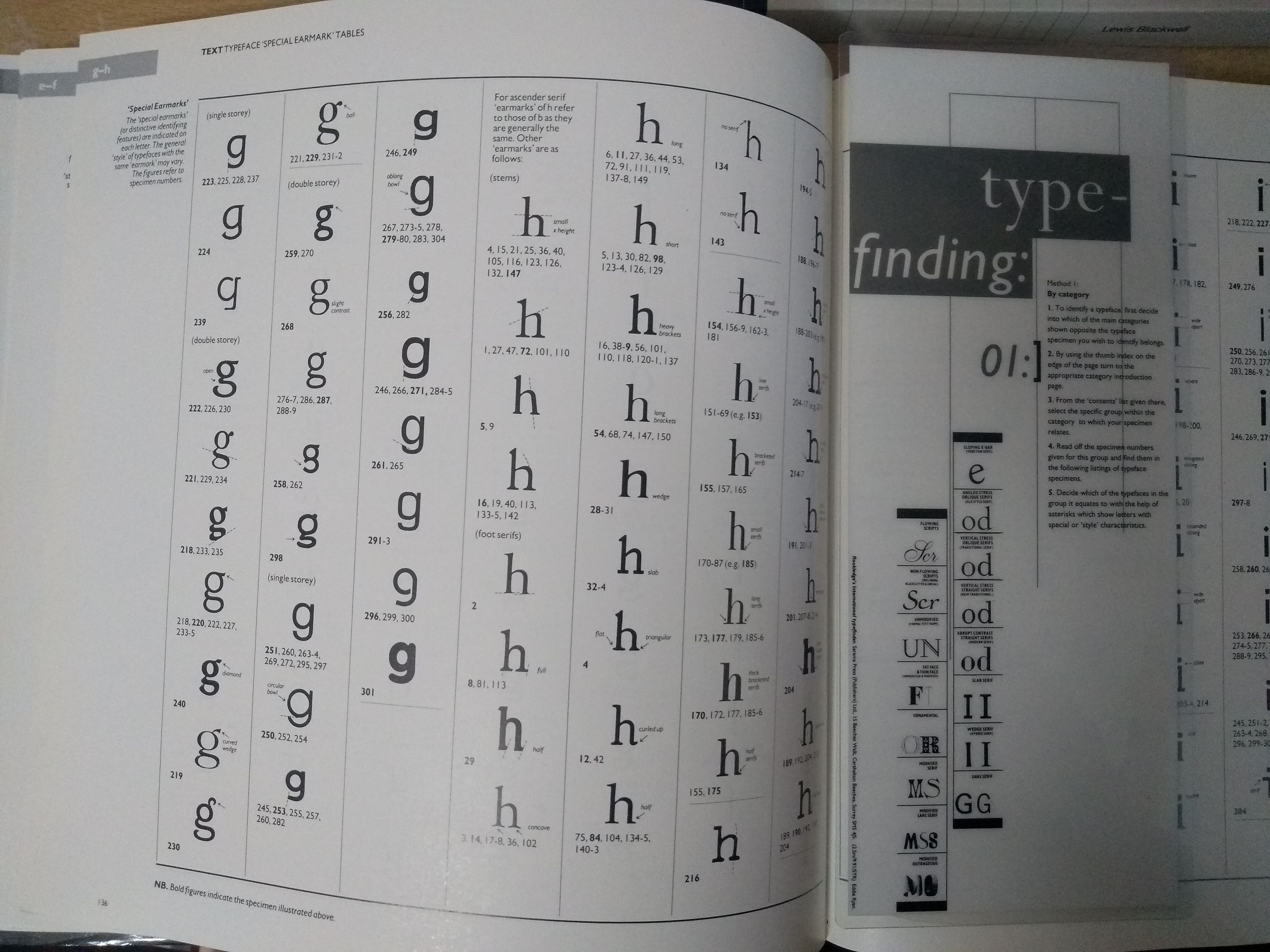
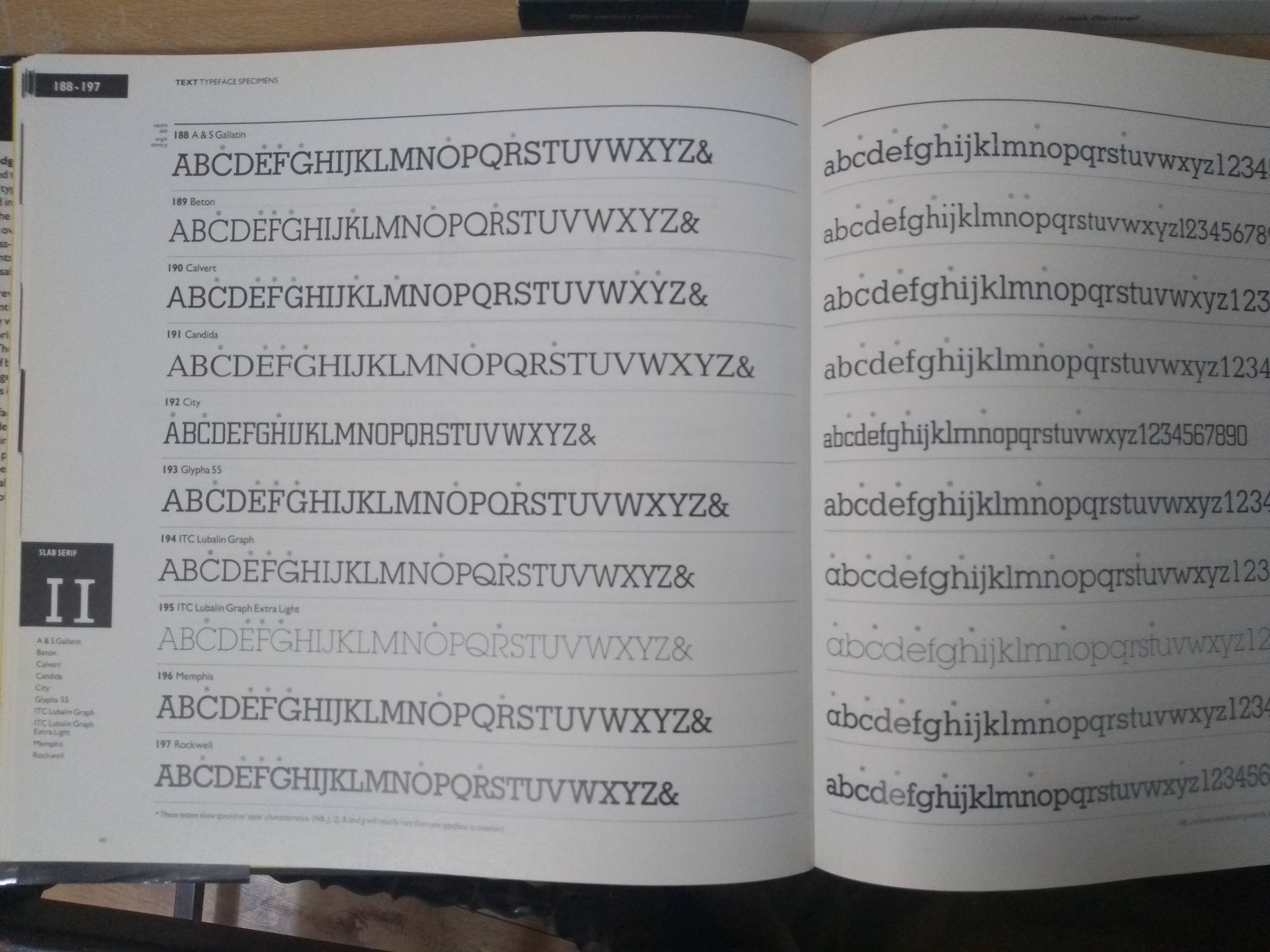
It's a pre-internet version of WhatTheFont. Frankly it is more ambitious than it is practical. It aims to be a typefinder that helps you, key by key and glyph by glyph, to identify a font from a sample. In the days before WhatTheFont, I have used it like that (slowly, because I am not very practiced), but it's more fun and useful as a specimen book. That's partly because it's skewed towards a font selection that you are likely to find in the wild and want to make use of. It's quite dated now.
Letraset Catalogue
Or as it's actually called: Letraset Graphic design handbook.
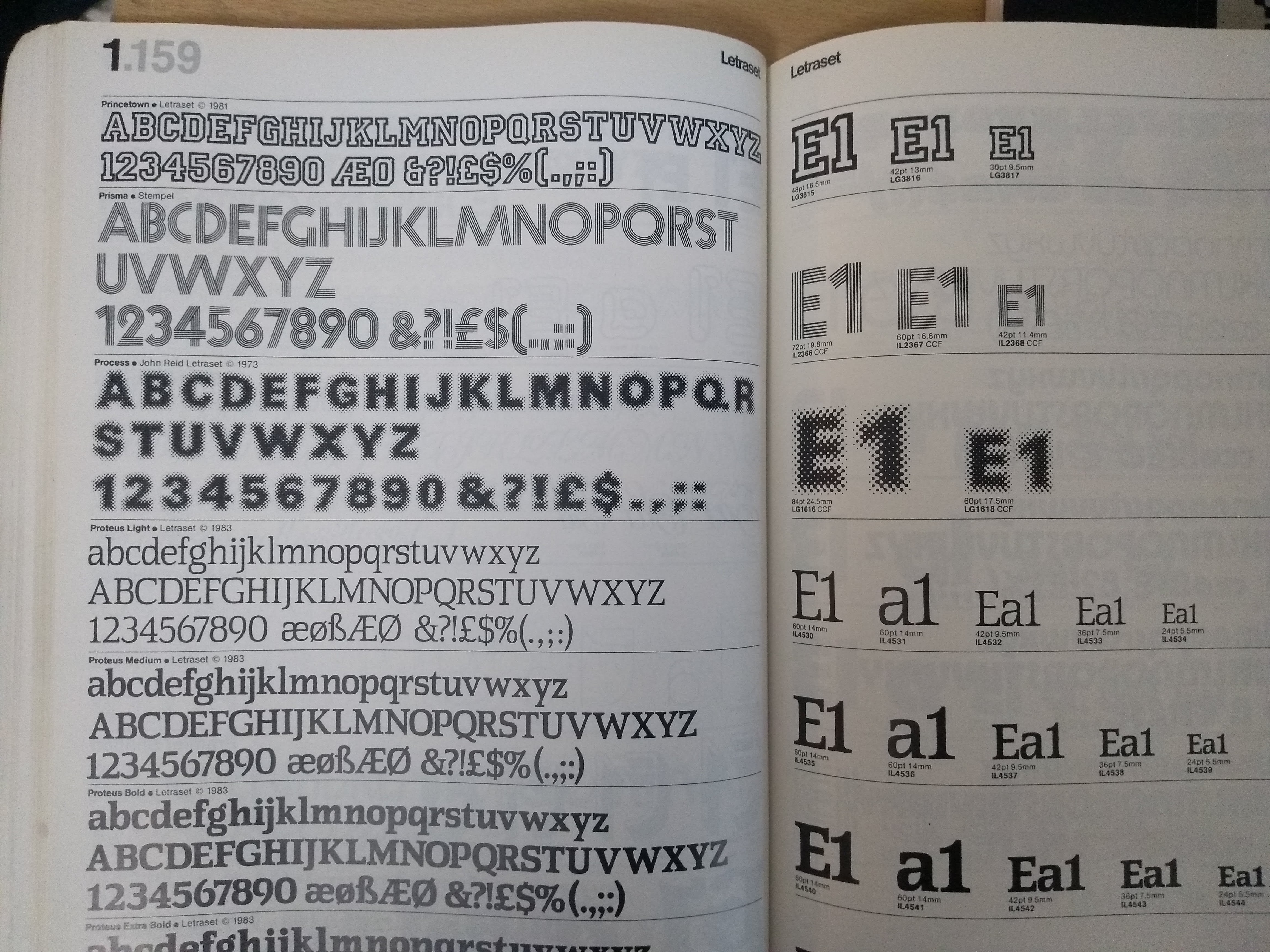
I bought this both for its vintage nostalgia and for its type specimens. It's useful just for flicking through to find fonts or ideas. It's not comprehensive, but it is authentic to an era, and most of the popular and enduring classics represented, as well as some very Letraset oddbals (like Process, pictured). The specimens are laid out at the same size for comparison. On the right the letters show the available sizes in their exact size, allowing them to be measured against your own artwork. One unusual aspect is giving the font sizes in millimetres as well as traditional points. Again, a useful aid to people with artwork in millimetres but possibly also a nod to the early days of metric typography.
Blackwell, “20th century type: remix”
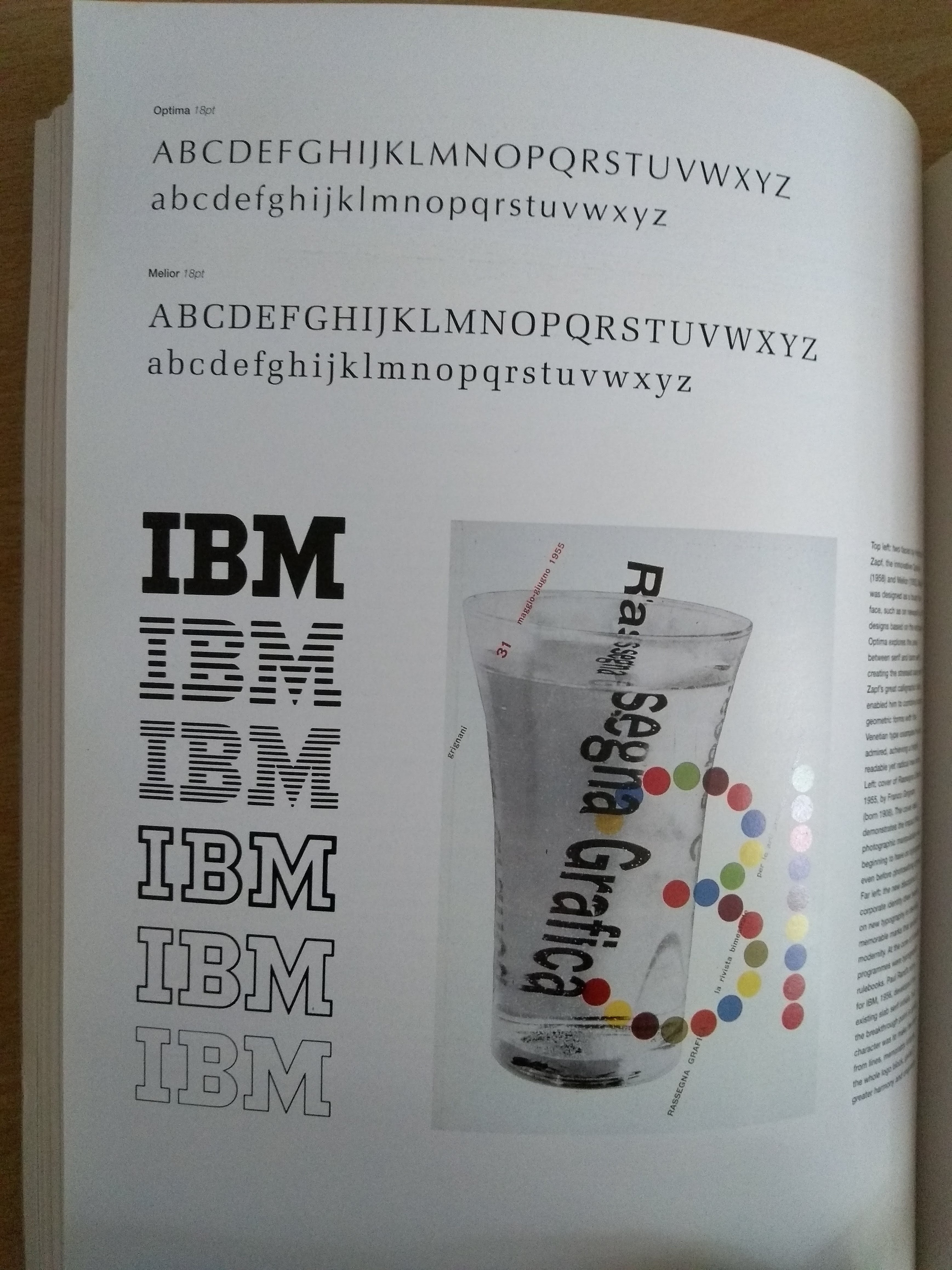
I bought this because it looked quirky. And then I also bought the earlier “20th century type” by the same author because I couldn't tell how different they were. The remix in the title is approximately correct; this book, the later one, is more than an ordinary second edition. It has been reworked and remixed with the author adding in more personal licence.
It's a charming retrospective on 20th century typography.
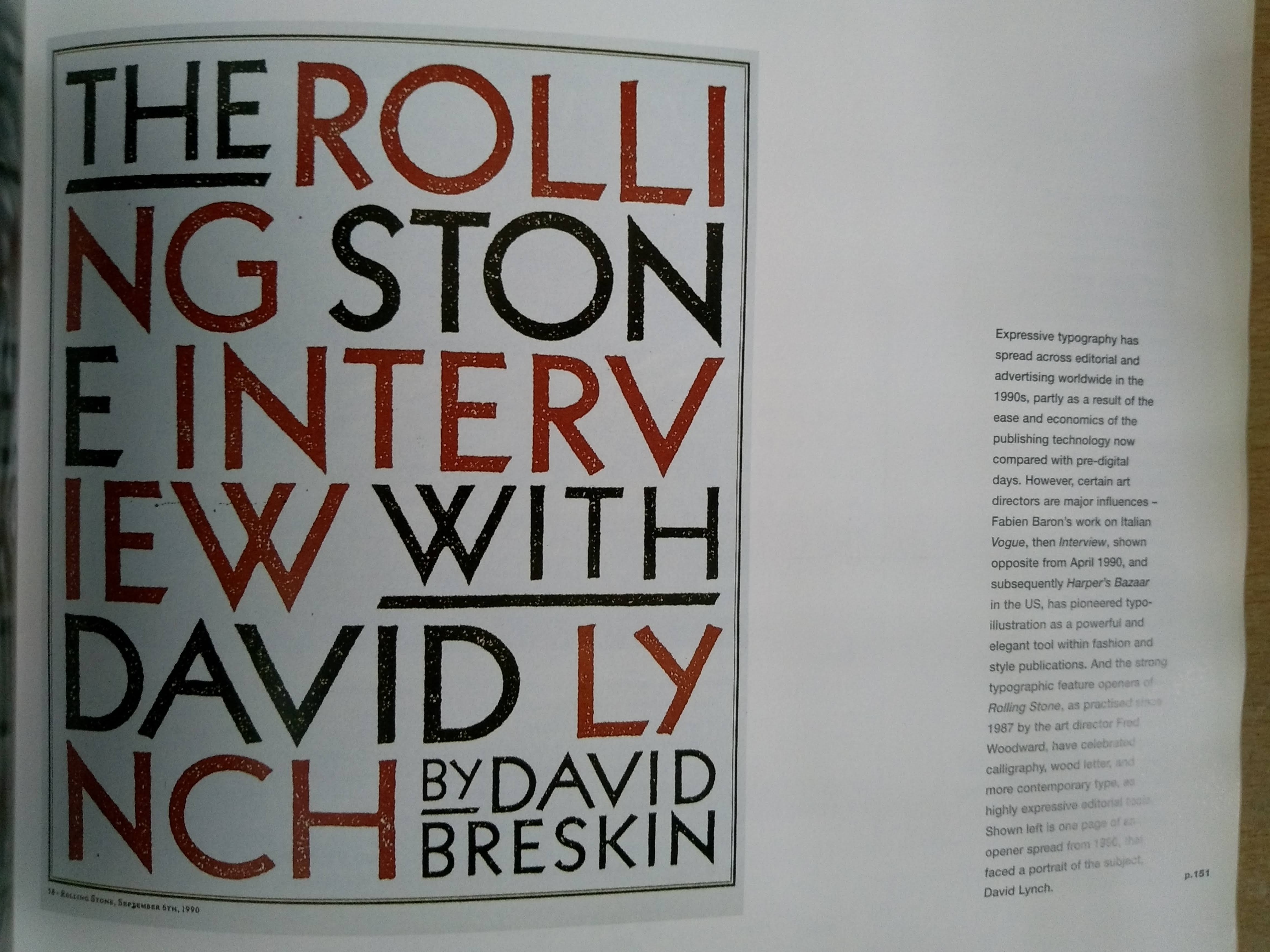
All printed matter is fair game in this review: As well as the expected artefacts―adverts, posters, books―there are plenty of surprises and items of niche interest. Such as the Rolling Stone cover or the IBM logo (pictured above).
Toshi Omagari, “Arcade Game Typography: The Art of The Pixel Type”
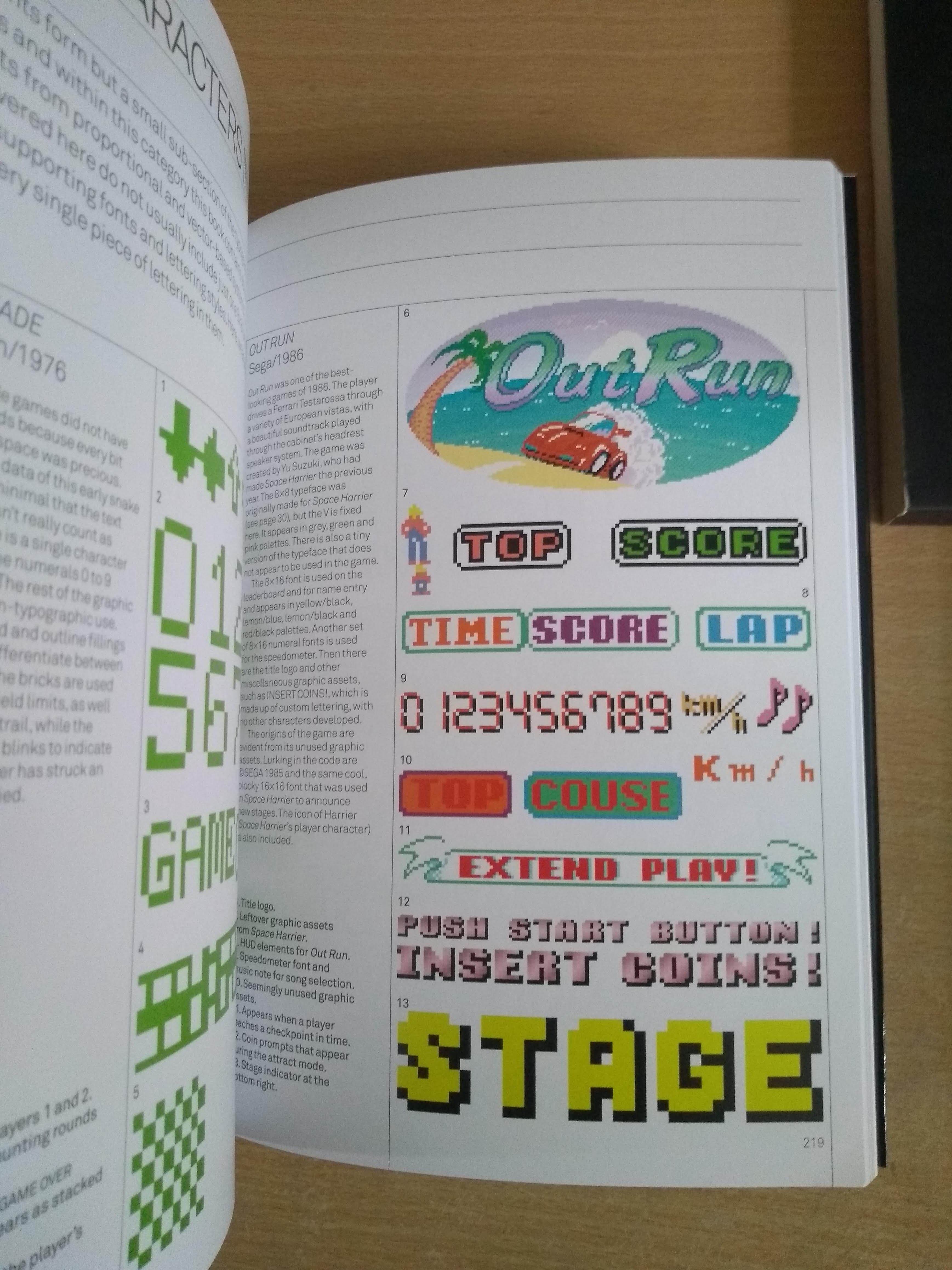
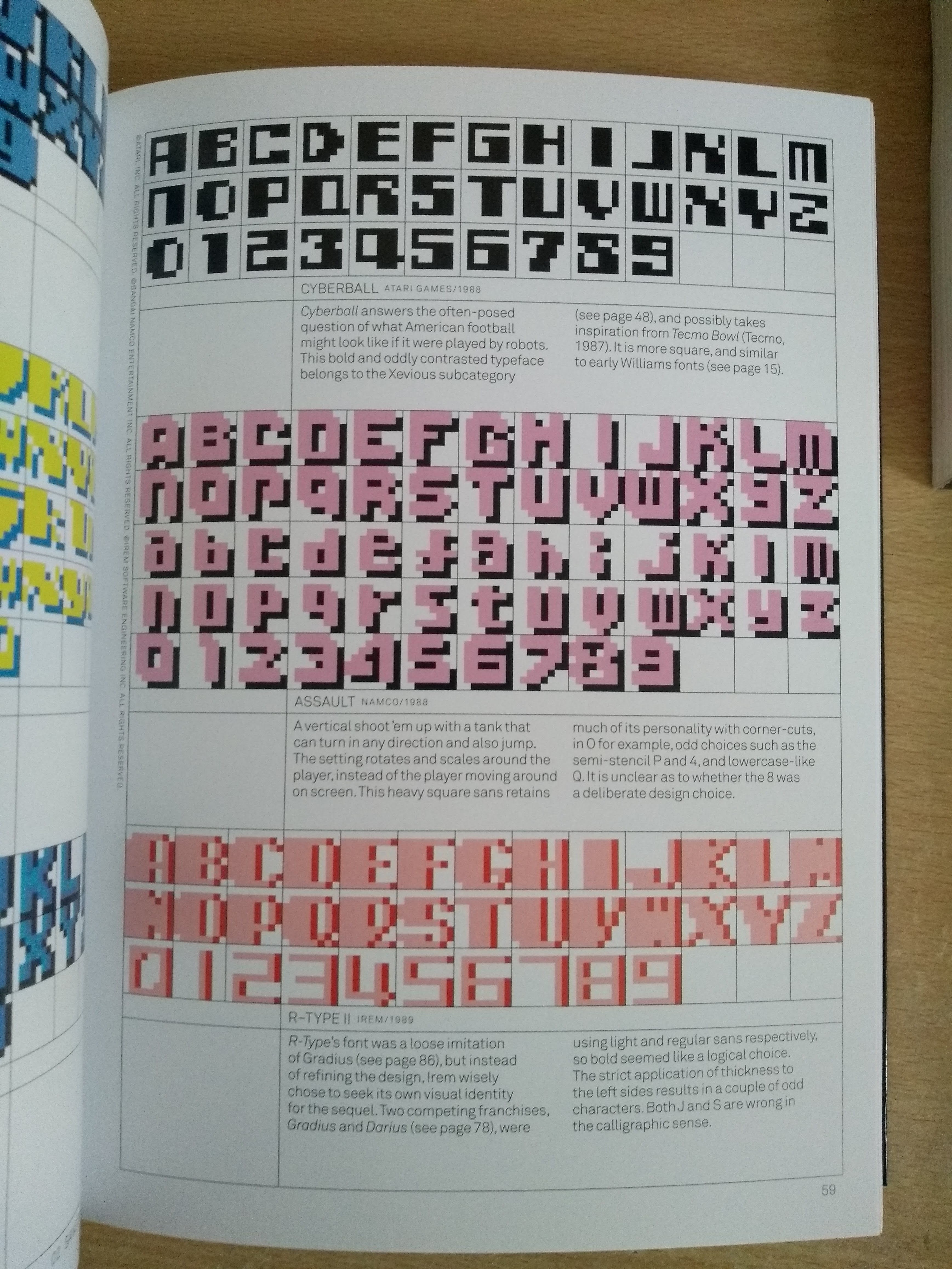
I fell in love with this gem as soon as I saw the cover. I feel lucky to have found it through a chance recommendation.
I suspect that this is the first really serious attempt to investigate Arcade Game Typography. The first move in this critical space has a lot of groundwork to lay: genres to define, histories to write, theories and rules to write. The rules of this work are: 8×8 pixels, monospace, featured in a published arcade game. There is ample discussion and display in what amounts to a comprehensive collection of The Pixel Type. Special layouts, essays, and full- and double-page spreads break up what could otherwise be a monotone work.
Beautiful book design and printing.
There is even the discovery of a genre unique to video games. The Letraset favourite Data 70 is an amusing graphical oddity in most of typography, but here in the world of video games, the graphical style is used so much that it has been elevated to a genre: MICR, short for Magnetic Ink Character Recognition.
Epilogue
Between writing these words and finishing them for release, I have already made more extensive notes for some of these books, and my collection is still expanding. Maybe there will be more comprehensive reviews soon?